How to Choose Throw Pillow Colors for a Neutral Sofa
Choose throw pillow colors for a neutral sofa by looking at the room before looking at the cushions. Start with a color you already enjoy in the rug, artwork or curtains, then decide whether the sofa needs a quiet blend or a stronger contrast. A cream, grey or taupe sofa gives you options, but the same cushion will look different against each one.
You do not need a complete new set. Try the covers you own first, and change the piece that feels out of place. The three palettes below are starting points you can adapt to your room, followed by ways to work out why a combination is not quite right.
Read the Sofa Color Alongside the Rest of the Room
Neutral does not mean colorless. A cream fabric may look yellow beside a bright white cushion; grey may appear blue, green or violet next to another textile. Taupe often sits somewhere between brown and grey. These differences can be subtle, so compare fabrics together instead of relying on their product names.
Lay a few existing covers or fabric samples against the sofa in daylight, then look again with your usual evening lamps switched on. Check from the doorway as well as close up. Phone photographs can help you compare arrangements, but their color processing is not a substitute for looking at the actual fabric.
Choose one existing element to guide the palette. A patterned rug might provide a muted green; a print above the sofa might suggest a blue. You do not have to reproduce every color in that object. Crate & Barrel’s throw pillow styling guide also starts with a color palette, which is a useful way to narrow the choices before mixing individual pieces.
If nothing in the room suggests a color you like, begin with a favorite cover you already own. Our guide to refreshing your home with what you have offers more ways to try existing textiles and accessories in new places.
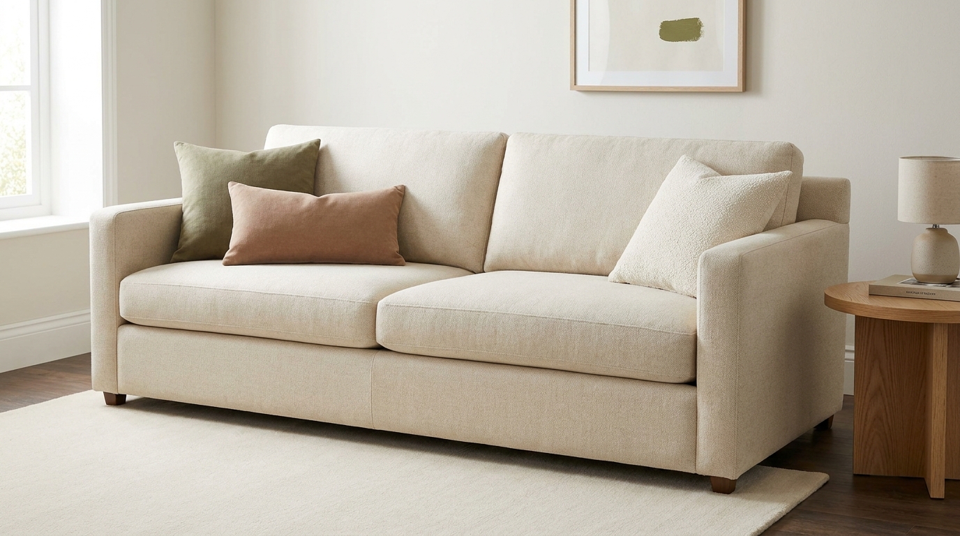
For a Cream Sofa: Try Olive, Muted Clay and Textured Ivory
This palette is an option for a cream sofa in a room with warm wood, natural fabrics or earthy artwork. An olive cushion gives the light upholstery a darker point of contrast. Muted clay adds another color, while textured ivory keeps part of the arrangement close to the sofa.
For an ivory or cream sofa with a dark floor, start with textured ivory and one muted olive cushion. This gives you a light base with a little contrast. If you want to connect the cushions to a dark brown floor, try a small brown stripe or piping rather than another large block of dark color. Add muted clay only if you want extra warmth or already have that shade elsewhere. Check the covers against both the sofa and floor in daylight before choosing the final combination.
For a quieter version, leave out the clay and vary the textures instead: an olive cotton cover beside an ivory woven one, for example. If the ivory almost disappears into the upholstery, try a more distinct weave or a slightly deeper oatmeal shade. You can create separation without adding a bold print.
Check the sofa next to the lightest cushion. If a stark white makes the cream fabric look more yellow than you like, try a softer off-white rather than assuming the sofa needs replacing. This is a preference to test in your room, not a rule that cream and white cannot mix.
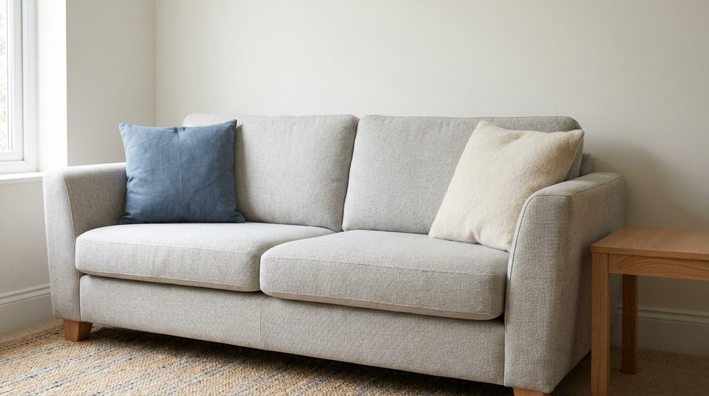
For a Grey Sofa: Try Muted Blue and Ivory
A muted blue and ivory pairing gives a grey sofa a simple two-color starting point. Try blue with enough difference in depth to stand out from the upholstery, rather than a blue-grey that blends into it unintentionally. Ivory can provide a lighter break between the darker colors.
On a pale grey sofa, a deeper denim blue may provide the contrast you want. On charcoal, you might prefer a lighter dusty blue so it remains visible. Choose the version that relates to the room’s rug or artwork, rather than treating every grey sofa as the same shade.
If the combination feels colder than you want, try an oatmeal cover in place of the ivory or borrow a warmer-colored throw before buying more cushions. You are testing the whole room, including its walls, floor and light. Blue is an option for grey, not its required partner.
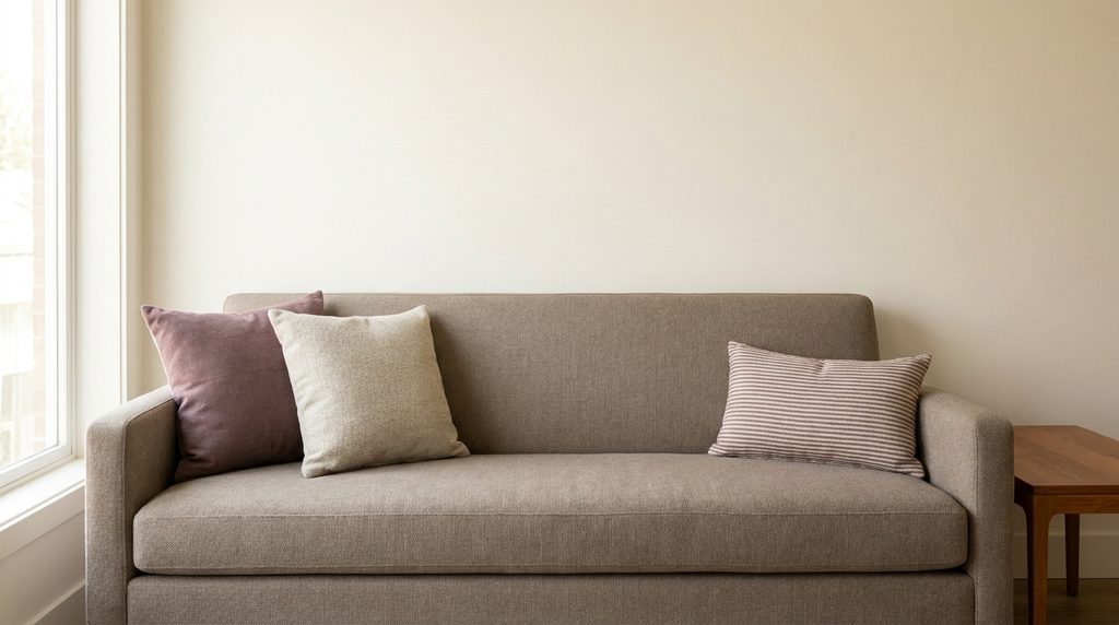
For a Taupe Sofa: Try Dusty Plum, Oatmeal and a Subtle Stripe
Taupe can be tricky because two fabrics with that name may lean in different directions. Hold a dusty plum sample against your sofa before committing: it may suit a grey-leaning taupe, while another shade could make the upholstery look different from what you expected.
Use oatmeal as a lighter companion and try a small striped cushion that repeats both the neutral and plum tones. The stripe connects the separate colors without requiring another accent. Keep its background close to one of the other fabrics if you want the group to feel quieter.
If plum is not right for your room, try a muted olive in its place. Keep the oatmeal and choose a pattern that picks up the new accent. Changing one part at a time makes it easier to see whether the issue was the color, its brightness or the amount of pattern.
Repeat Throw Pillow Colors While Varying the Pattern
Once the colors feel right, decide whether you need a pattern at all. Solid covers with different textures may be enough, especially beside a detailed rug or busy artwork. Texture adds variation without introducing another set of shapes.
If you want a print, choose one that includes a color from a solid cushion. A large botanical motif beside a finer stripe can create a different effect from two equally bold prints. Judge them from across the room: details that seem distinct in your hands can merge at a distance.
Keep some plain fabric visible between patterned pieces. You can repeat a stripe at both ends for a more ordered arrangement or use one patterned cushion for an uneven grouping. Neither approach needs a fixed number of cushions; leave enough space to sit comfortably.
If the Combination Feels Wrong, Change One Thing
Everything blends together: try one noticeably lighter or darker cover. When sofa, cushions and throw are nearly the same depth of color, a small difference in shade may be hard to see from the doorway.
One cushion dominates: remove it briefly. If the room feels better, try a more muted version of its color or use that accent on a smaller cushion. You do not need to repeat a color elsewhere just to justify keeping a piece you dislike.
The group feels busy: replace one patterned cover with a solid that repeats a color already present. Also check the throw and rug; the cushions may be only part of the competing pattern.
The cushions look disconnected from the room: compare them with something you intend to keep, such as the curtains or a favorite print. If you are also reconsidering the artwork, our guide to arranging wall art above a sofa helps you plan that area without crowding the seating.
Test the Covers Before Buying a Whole Set
Use swatches where available and compare them on the actual sofa. Screen colors are only a guide. Check the cover dimensions, insert compatibility and care instructions as well: a color you like is less useful if the fabric feels uncomfortable or needs care that does not suit your household.
Try the smallest change first. One new cover may connect two cushions you already own, while removing a bright throw might settle the entire palette. Keep the combinations you enjoy in both daylight and evening light, and stop when the sofa feels comfortable to look at and use.
Frequently Asked Questions
What color throw pillows go with a beige sofa?
Start with a color you already enjoy in the rug, artwork or curtains. For cream sofas try olive, muted clay and textured ivory; for grey try muted blue and ivory; for taupe try dusty plum and oatmeal. Always test covers on the actual sofa in daylight and evening light.
How many throw pillows should be on a sofa?
There is no fixed number. Leave enough space to sit comfortably and keep some plain fabric visible between patterned pieces. Neither a strictly ordered arrangement nor an uneven grouping needs a set count.
Can you mix patterns on throw pillows?
Yes. Choose prints that include a color from a solid cushion, judge them from across the room since details merge at a distance, and keep plain fabric between patterned pieces. If the group feels busy, replace one patterned cover with a solid in a color already present.
Should throw pillows match the rug or the sofa?
Match the room first, not the sofa alone. Repeat one existing element such as a blue stripe from the towels, a warm neutral from the tile, or a muted shade from artwork. If the cushions look disconnected from the room, compare them with something you intend to keep, like the curtains.
Why do my throw pillows look wrong even though the colors match?
Change one thing at a time. If everything blends together, try one noticeably lighter or darker cover. If one cushion dominates, remove it briefly and try a more muted version. Check texture too: an olive cotton beside an ivory woven cover can create separation without adding bold print.